How to change the width of your games list in the new Steam UI (October 2019)
tl;dr: The new UI is all based on CSS so changing the look is as simple as changing that file. Make the changes yourself following the instructions below or download and replace the file.
Unlike most people, I was pretty excited and happy to see the new Steam UI changes. The classic UI was functional, but that's pretty much all it had going for it with that 90s Windows user experience. You had your menu bar, list of games and main window for whatever item you selected. Utilitarian.

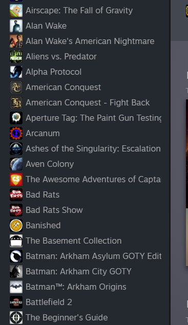
I haven't given the new UI too much use to really have any solid opinions yet, but I am happy to see a new coat of paint on a platform I put so many hours into. The new UI is fresh, modern looking and finally feels like it fits in the with the Steam store. However, there is one issue that instantly caught my attention and had me searching for answers.